Creating a User-Friendly Login Page from Scratch on Figma
Hello everyone! Today I decided to share a simple login page that I made with my Figma and some procedures that probably one or two people can learn from. I said in my last post that I was going to share some designs before I shared some codes of what I do when I am able to learn.
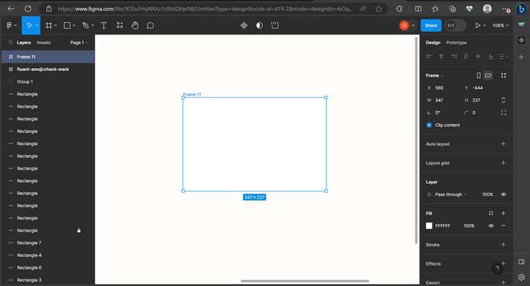
To start with, I created a frame, which is where I will be doing all the login pages.
For the header, user login, I used:
Font: Inria Serif
Font Style: Bold
Font Size: 20
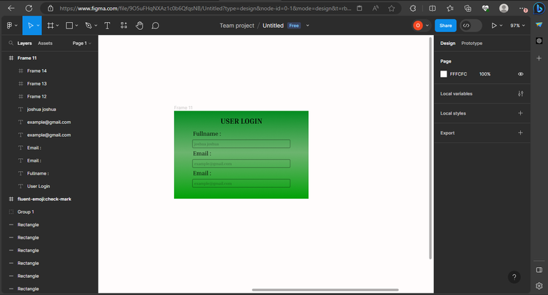
For the containers:
Font: Inria Serif
Font Style: Regular
Font Size: 15
Container width: 251
Height: 20
Corner radius: 2
Login button:
Font: Inria Serif
Font Style: Bold
Font Size: 20
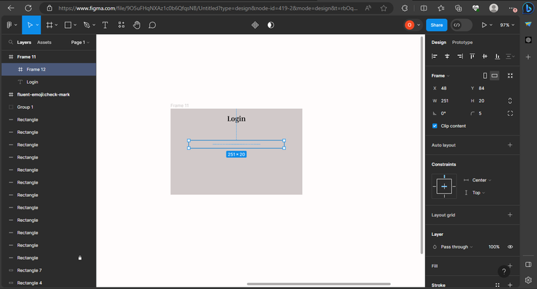
I filled it with a color to separate it from the main work page, but the color is a family of white. I added a text, which is the login text, and also added a frame for the full name segment.

After that, I added the color black to the container that I created for the full name and then created another container. Initially, it was supposed to be username and password, but I got carried away, and there will be corrections to that.
After creating the container for the username, I created the login button, still using a frame, but I will align everything later because this is still a work in progress. After I had done all that, I added a full color to the layer frame and used a linear color design to make it look so different. More so, I was actually looking for a color to make it look unique, and I decided to use the green and white mixture.
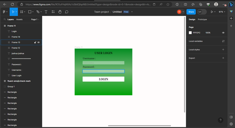
Now, it is making sense after I have made some design corrections to the design. Now I have made a decision on what to do, and you can see how different it looks. Then I had to add some icons and fake text to each container to make the user understand when he or she wanted to use the login page.

I got these icons from iconify where you can get a series of icons to use for your designs to make them look so attractive and appealing to everyone. After I added the icons from iconify, I had to reduce the sizes of the icons so that they could fit the container, and then I aligned them to the left side of the container. The login button was aligned in the center to give it a different look.
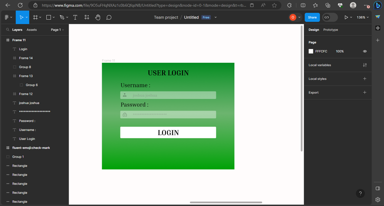
And after all the design work, I arrived at the final stage of the design, where I was able to make a login page with a username and password container and also a login button.

FINAL DESIGN
This is just a free design I made in my head without getting inspiration from anywhere. I actually decided to try it out and see if I could come up with something meaningful without getting inspiration from anywhere. Lo and behold, I was able to come up with that.
To anyone who might have a correction to this, you are very welcome, and I will appreciate that in the comment section of this post. We are all here to learn, and I will be looking forward to learning from you all. Corrections are allowed and welcome.