Reimagining the SPK Network Logo for the Future of Web3
Hello SPK Network team!
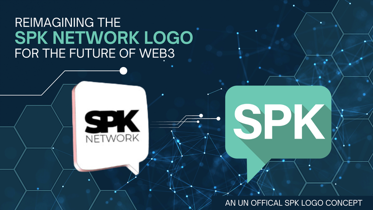
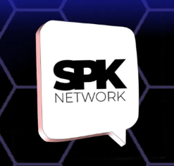
I'm a fan of the innovative technology you are developing and see great potential for the future capabilities you are enabling. However, I don't believe your current logo properly conveys the sleek, modern aesthetic that aligns with a professional web3 company designing the digital media future.
In my opinion, a logo serves as that critical first impression for users, investors and the broader ecosystem. Yours could be stronger. With that in mind, I took the liberty of redesigning an SPK logo concept that I feel embraces more of a contemporary web3 look and feel.
Attached to this post are PNG images of the redesigned logo, which I created using Adobe Illustrator (happy to provide the .EPS file). I utilized the unique color hex code #6CC8B3 to stand out, just as your technology does. I also made a black and white version that can be used when color is not suitable.
| Color | BW | Transparent |
|---|---|---|
 |  |  |
I implemented the bold "Acumin Pro" font for a straight, tech-forward impression. Overall, I aimed for this refreshed logo to project innovation and leadership befitting the trailblazing solutions you are pioneering.
Please feel free to utilize this SPK logo redesign concept in any way useful, if you find it impactful. Or let it spark ideas as you revisit your branding to match your cutting-edge trajectory.
Wishing you the utmost success with your ambitious proposal, and I eagerly look forward to seeing SPK Network continue accelerating into the future.