LeoFinance's New UI: The Perfect Solution for Both Novice and Expert in Web3 (LEO&HODL)

So after a full week of using it everyday now is the time to provide some feedbacks.
Only feedbacks are the way to help team fix where it's required and so I'll try to share what I have experienced so far.
The First Impressions of New UI
The launch was smooth and I logged in on Leofinance from my mobile browser with Hivesigner and there are other options as well working normally.
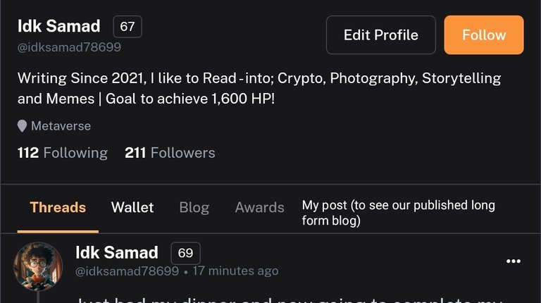
On homepage we see microblogging interface which is known as Leothreads and it has been working impressively fine now after all tons of threads, comments are being posted on daily base still user experience is much better and clean like one click upvote, posting thread and comments in one click.
The notification section works properly for me and I like this particular thing of notification section more

Notification section first show your actual post or comment and than the reply of person under it. So, it makes easy for you to reply back knowing what conversation you were having.
Walletis also working smoothly and have also tried to power up $LEO and it went successful.

Some Work to be done on Long form content side of Leofinance
There some features missing on the long form content and team is also aware of it but just Incase this feedback might help regarding it.So, firstly I'm browsing on mobile phone and when I tried to write a long form post on new UI

I can't find any place to add title of post.
And than I saw another thing missing which is "My Posts" option in profile
To see published blog and that's the only thing have noticed so far while explore section is already there to see long form posts.
This Version is 100x Better than Previous One
This new UI is like 100 times more better than the old one. It is more perfect for Both Novice and Expert in Web3 coming on Blockchain first time.
From onboarding process with lite accounts makes it faster and simple to create account and than using Leofinance has become more like scrolling on advanced version of twitter.
Some newbies find it hard to understand how things work but with less complexity there is need to remove "lot of manual actions need to be performed" which is something I have seen in this UI.
How can new Lions engage on new UI?
Well, that's something simple with multiple login choices you need to pick one that is suitable for you and when you are logged in.
On screen you see this whole interface

Where you can see Threads posted by different people to engage with and one advice to boost your experience is "customize your feed according to your preference" by turning on "one click vote's & hide threads including links" if you want to.
The best features of the new version
In my top list of best features it is Decentralized Polls than the dark mode and one click vote's as well as bookmark post or threads.
These are some of my favorite features in this new UI and Incase you don't know every Friday there's high probability of a new feature to be included.
Wrapping up...
In the end it's been just a week of this launch and we have seen thousands of threads being posted on daily basis yet it is functioning well.
And hopefully this feedback of mine will help in development any possible way. Looking forward to exciting things coming in future.

https://leofinance.io/threads/view/idksamad78699/re-leothreads-bcmrevt3
The rewards earned on this comment will go directly to the people ( idksamad78699 ) sharing the post on LeoThreads,LikeTu,dBuzz.