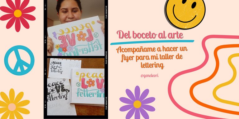
Del boceto al arte: acompañame a hacer un flyer para mi taller de lettering (ESP-ENG)
¡Hola hivers!💜
Estoy encantada de volver a esta comunidad artística. Quería mostrarles un poco acerca de mi proceso creativo a la hora de hacer un flyer para mis talleres de lettering. Me gusta utilizar de fondo alguna imagen de algún taller anterior y añadir el flyer dibujado a mano con técnicas de lettering.
Tengo un emprendimiento llamado Poeticabyg, donde además de vender materiales de arte, lapiceros, marcadores, lienzos y caballetes, también dictó talleres de lettering. Por si no lo conoces, el lettering es el arte de dibujar letras y tiene muchísimas aplicaciones tanto en técnicas y estilos como en diversidad de materiales y superficies donde aplicarlos.
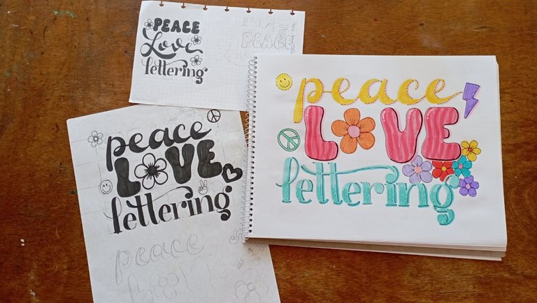
Me gusta que mis talleres sean temáticos. Tenía tiempo estudiando estilos de letras retro o groovy de los años 50 o 60 y me fascinan. Así que decidí hacer un taller con vibras groovy y retro, basándose en el estilo de letras e incluyendo elementos retro. Para esto arme un tablero de inspiración en Pinterest y encontré el título perfecto: Peace, love, lettering. Tomando en cuenta los estilos empecé a hacer miniaturas. donde estuve boceteando y probando los estilos.
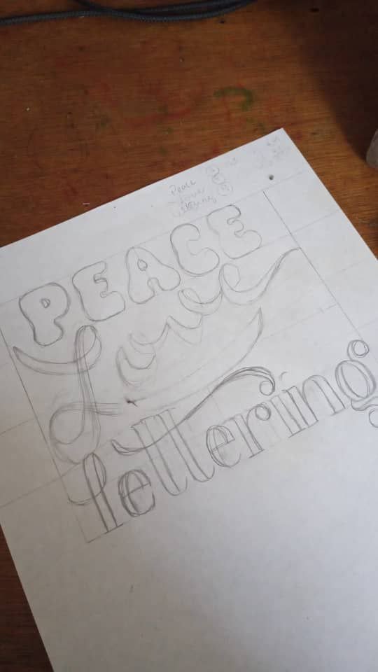
En mi primer boceto, dibuje Peace con letras sans serif, que son letras sin serifas, tienden a ser rectas, pero en este caso fueron gorditas con muchas curvas y movimientos. En el caso de Love, use un estilo cursivo donde la parte inferior tuviera un contraste alto. Para lettering me fui por unas serifas redondeadas, fluidas pero muy elegantes.
Honestamente, amé este diseño, peroooo sucedía que la letra L de Love, no se adaptaba o no encajaba con el resto del diseño, así que me causó algunos problemas. Hacer una composición de lettering es como armar un rompecabezas, tienes que engranar todas las palabras y ahí no podía lograrlo. Borre muchas veces y nada. Así que me tomé un día y decidí buscar otras ideas y bocetear de nuevo.
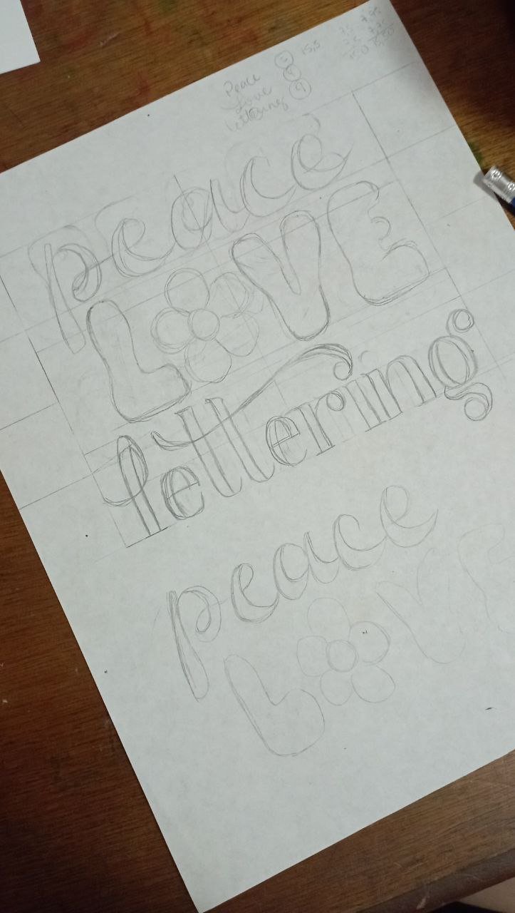
En este caso, hice un cambio entre Peace y Love. Peace fue cursivo con contraste inferior alto y Love fue con letras sans serif gorditas, tomando referencias de los doodles que pude encontrar sustituí la O por una flor muy groovy. Lettering siguió estando igual.
Aquí sí me sentí conforme. Así que avance a hacer el flyer oficial en una hoja más limpia. Elegí una paleta de colores retro, que es bastante cítrica con los rosados, fucsias y naranja, pero con toques azules y aguamarina para suavizar un poco.
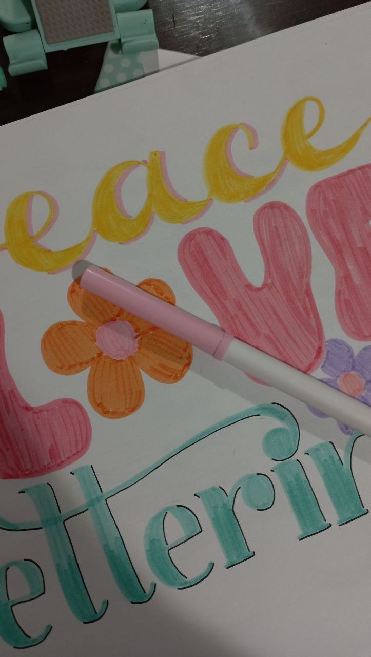
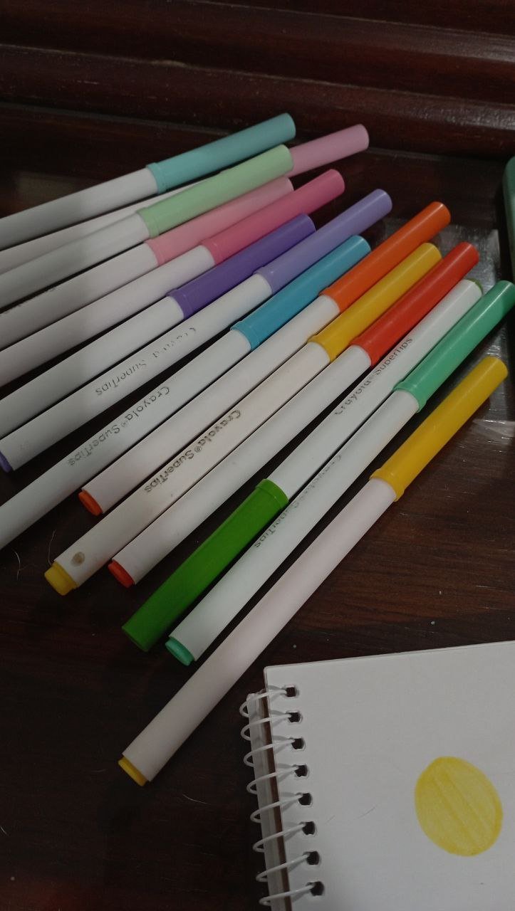
Dibuje las bases y empecé con mi parte divertida: los detalles. La elección del tipo y color de delineado, sombra, degradados y otros elementos es crucial y le dará una vuelta completa al diseño. Y siendo honesta, es la parte que más disfruto.
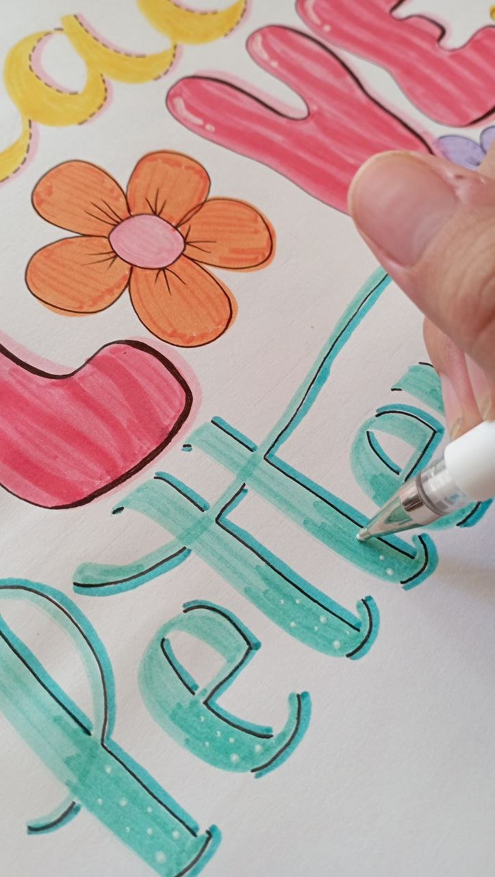
Otra cosa que me gusta agregar son doodles o garabatos que hagan referencia al tema. En este caso use flores (para rellenar un espacio en blanco en la composición), carita feliz, símbolo de la paz y un rayito.
Quedé contenta con el resultado. Ya solo me queda tomar las respectivas fotos y promocionar el taller. Cuéntame, ¿qué te pareció mi proceso creativo? ¿Alguna recomendación?
Gracias por leerme
Con cariño, G.

Hi hivers!💜
I am delighted to be back in this artistic community. I wanted to show you a little bit about my creative process when making a flyer for my lettering workshops. I like to use an image from a previous workshop as a background and add the hand drawn flyer with lettering techniques.
I have a business called Poeticabyg, where besides selling art supplies, pens, markers, canvases and easels, I also teach lettering workshops. In case you don't know it, lettering is the art of drawing letters and has many applications in techniques and styles as well as in the diversity of materials and surfaces where to apply them.
I like my workshops to be thematic. I had some time studying retro or groovy lettering styles from the 50's or 60's and I am fascinated by them. So I decided to do a workshop with groovy and retro vibes, based on the lettering style and including retro elements. For this I set up an inspiration board on Pinterest and found the perfect title: Peace, love, lettering. Taking into account the styles I started making miniatures, where I was sketching and testing the styles.
In my first sketch, I drew Peace with sans serif letters, which are sans serif letters, they tend to be straight, but in this case they were chubby with lots of curves and movements. In the case of Love, I used a cursive style where the lower part had a high contrast. For lettering I went for rounded serifs, fluid but very elegant.
Honestly, I loved this design, but it just so happened that the letter L in Love didn't fit in with the rest of the design, so it caused me some problems. Doing a lettering composition is like putting together a puzzle, you have to fit all the words together and I couldn't get it right. I erased many times and nothing. So I took a day and decided to look for other ideas and sketch again.
In this case, I made a change between Peace and Love. Peace was cursive with high lower contrast and Love was with chubby sans serif letters, taking references from the doodles I could find I replaced the O with a very groovy flower. Lettering remained the same.
Here I did feel satisfied. So I went ahead to make the official flyer on a cleaner sheet. I chose a retro color palette, which is quite citric with pinks, fuchsias and orange, but with touches of blue and aquamarine to soften it up a bit.
I drew the bases and started with my fun part: the details. Choosing the type and color of eyeliner, shadow, gradients and other elements is crucial and will give a complete twist to the design. And to be honest, it's the part I enjoy the most.
Another thing I like to add are doodles or doodles that refer to the theme. In this case I used flowers (to fill in a blank space in the composition), smiley face, peace symbol and a lightning bolt.
I was happy with the result. Now I just need to take the respective photos and promote the workshop. Tell me, what did you think of my creative process, any recommendations?
Thank you for reading me
With love, G..
FUENTE
Fotos: tomadas por mi desde mi redmi 10
Traducción: Deepl
SOURCE
Photos: taken by me from my redmi 10
Translation: Deepl
Wow, genial trabajo!
Gracias!💜
Me gusta mucho la idea, te quedo muy bonito. saludos !!
Gracias por tu comentario! saludos!💜